30 Jul Loreak, a new style and concept
Loreak is a unisex fashion firm based in Irún, Euskadi (Basque Country). It creates its own collections of all kinds of fashion products and accessories targeting a young and uninhibited audience and has a network of stores in several cities in Spain and France, as well as a vibrant online store, thus becoming a benchmark in urban fashion. It is currently undergoing a phase of expansion.
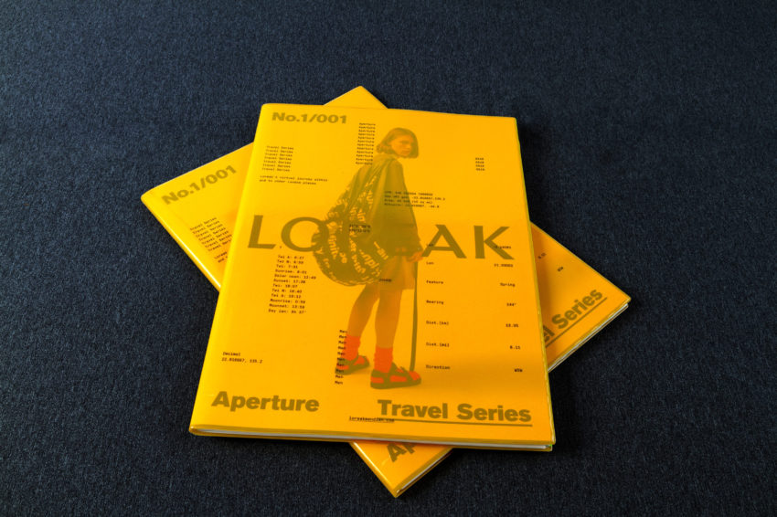
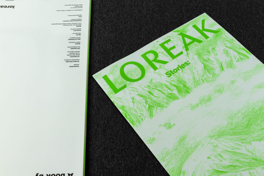
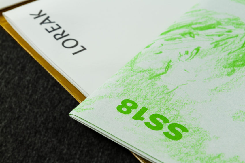
For two seasons, as a result of the symbiotic work of the Pensando en Blanco studio, headed by its art director Borja Garmendia, and the Barcelona designer Carles Murillo, it has created constantly original and innovative graphic images and catalogues. At Nexe/Agpograf we are delighted that they have placed their trust in us and it is a pleasure to help them with their graphic production and provide industry advice. In addition, this year it has received awards in several categories of the Laus Awards for graphic design.
LAUS Awards links
Silver Category CORPORATE PUBLICATION
http://www.adg-fad.org/es/laus/proyecto/aperture-loreak
Bronze Category COMBINED ELEMENTS
http://www.adg-fad.org/es/laus/proyecto/loreak-2
Bronze Category EXPERIMENTAL LETTERING/TYPOGRAPHY
http://www.adg-fad.org/es/laus/proyecto/loreak-1
Interview with Borja Garmendia and Carles Murillo
Art directors of the project
What is Loreak’s goal in presenting this catalogue?
Loreak’s goal, as well as that of the new brand management project, is to establish a moment of assertion and valuation for the brand, working on all the aspects and sections of the image which come into play, including the product, clothing proposal, graphics, image etc. This is a difficult process, during which we’ve done the work with a broad vision, connecting each of the components of the brand.
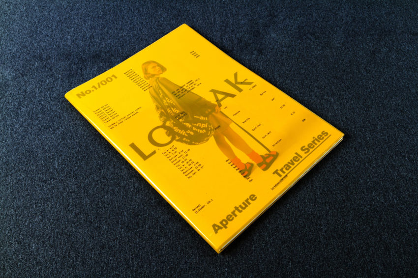
When it came to planning the project for this catalogue, we looked for an element that could be used to present the new phase of the brand. With an easy-going attitude regarding the form, formats and structure of the catalogue, we searched for an impact to serve as an analysis to explain what the brand intends to achieve in the coming years. A campaign catalogue which, in turn, has become the corporate catalogue and the brand’s main tool.
It should be borne in mind that, in addition to the presentation of the new image, we now have a new brand name, with Loreak Mendian being replaced by Loreak. This change seeks to enhance the brand’s values and historical journey by means of greater accuracy and the strength of the message.
What inspired you to obtain such an original and, at the same time, complex graphic idea?
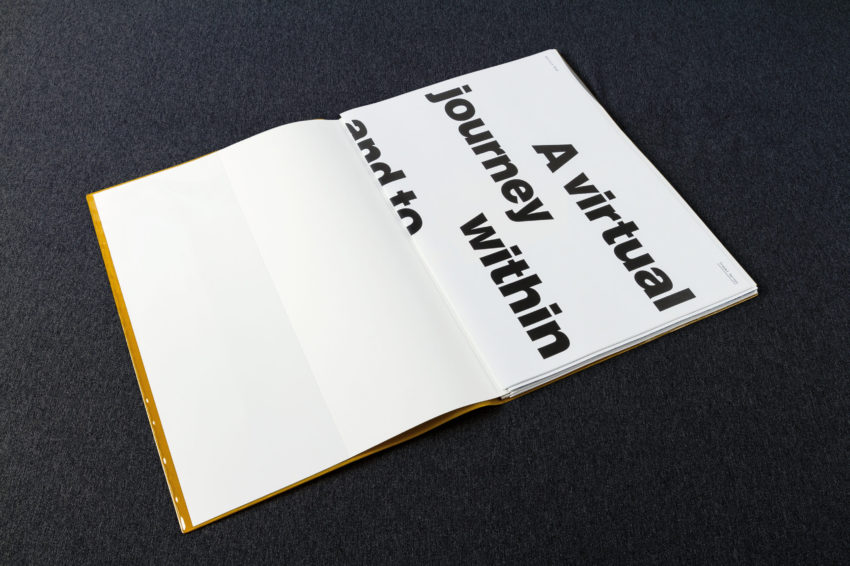
The brand has gone through many creative phases but has always sought skill, freshness and freedom in terms of the message, the use of photography and illustrations, etc. This part was always subject to a more “rational” component, influenced by the constant use of typographic compositions such as Helvetica, Akzidenz-Grotesk and so on. This gesture had to be expressed in some way, so we realized that we had to build a very solid and clean corporate base with a resounding typographic presence in order to secure the creative freedom of the brand with regard to the quality of the photography, illustrations, etc.
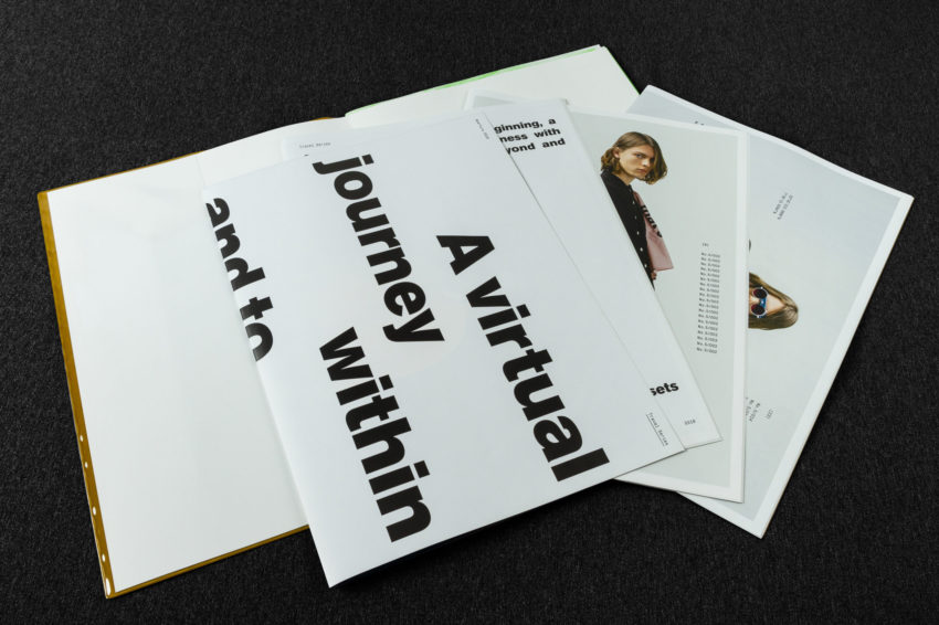
On this basis, the approach to the catalogue was similar, creating substantial support with freedom of composition and total use. We would thus achieve a catalogue-book and, by dismantling it, hundreds of individual posters and adverts that could be used independently as campaign images, street notices, gift posters for customers, etc. Complexity has been a hallmark of the brand, and so reaching the border of “controlled” turmoil was a challenge we were happy to address.
What difficulties have you encountered throughout the creation and graphic production process?
We’re talking about a fashion brand, so we all know that we’re subject to the pace of the industry and the need to generate graphic elements on an ongoing basis. It’s a very, very, demanding field that doesn’t let you sit back and enjoy what you’ve made. In addition, it’s a field in which people’s eyes are set on the market leaders and the “trends” they set. In this regard, the main challenge for the artistic and creative management has been to try and be true to ourselves, to our particular idea of understanding what Loreak means to us.
How do you rate the symbiotic task with the graphic industry in a project of this nature?
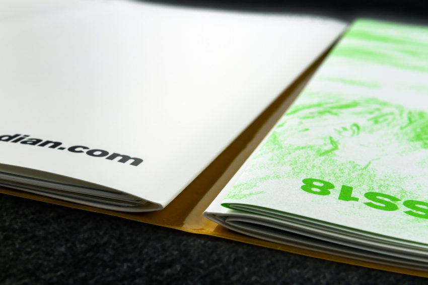
It’s essential work for us. Alignment with the graphic industry is vital in order to do a good job. This work has meant the machines making a huge effort (25 hours non-stop). We were faced with a complex piece with lots of facing pages and a wide range of papers, photographs, graphic compositions, etc. This requires the alignment of a lot of machine operators who understand the criterion we’ve established and have the ability to visualize and control each of the pieces.
What does it mean for your studio to have received this acknowledgement from the 2018 Laus Awards?
Without doubt, it’s recognition of the work done by the whole team throughout last year. For Loreak to somehow be part of the Spanish graphic design and communication industry is definitely important. The brand has always been closely linked to communication and graphic design and, despite being a fashion brand, we believe that, to a very great extent, it’s been a brand that has always greatly contributed to creation, and so having helped to obtain a small place in the sector is a source of great joy to everyone.

