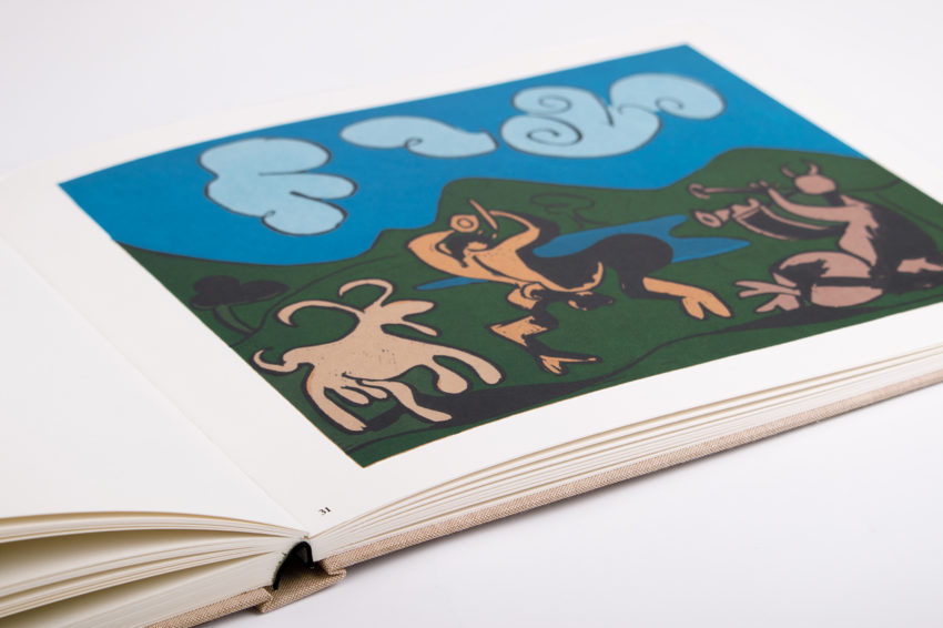
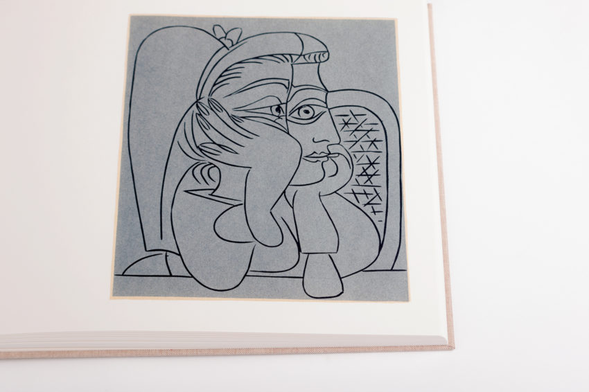
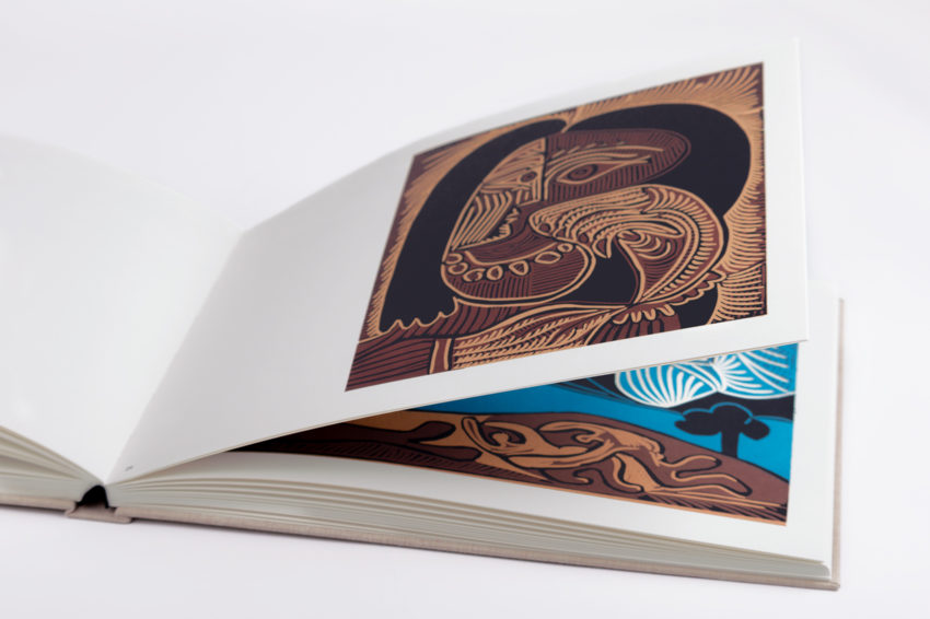
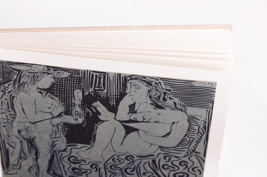
31 Jan Pablo Picasso Linogravures – Éditions Cercle d’Art
A brief overview
In the introduction of the book, published by Verlag Gerd Hatje, Stuttgart and Éditions Cercle d’Art, Paris in 1962, Wilhem Boeck tells us why the great artist started to make a book with this printing technique:
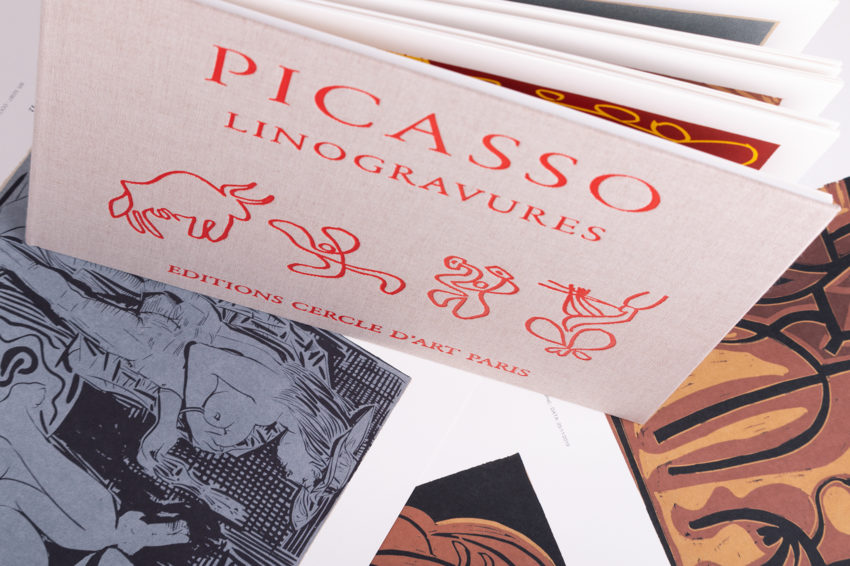
Picasso had recently become an adept of cut-linoleum printing. It was a new activity, and doubtless owed to the artist’s desire to give colour pride of place within printed creations when graphic arts had, until then, consigned it to a subordinate role – even in lithography. Taking up the gouge was less, for Picasso, about exploring a new realm of objects and forms, then exposing the forms he had mastered to the rigours of as-yet untested technical possibilities. As he did every time he embarked on a new task, be it sculpture, lithography, ceramics or aquatints, the result obtained can be compared to nothing but previous creations by Picasso himself.
Introduction
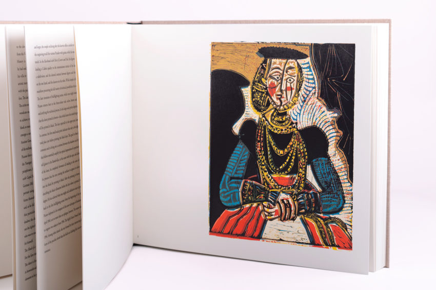
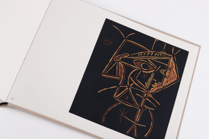
Once again Éditions Cercle d’Art have entrusted us with an exciting project, full of technical challenges, as was the updated edition of the “Toros y toreros” in 2017. In this case, the premise was based on the same problem, the only possible original as an element of reproduction was an original book edited and printed in a workshop in Stuttgart using the linography technique by the artist himself in 1962. Changing from a reproduction made by means of linography (Linocut) to an offset printing in current technology implied an important challenge, because the density and intensity of the colour are much higher in this ancient and artisan printing technique than in current graphic technologies.
Analysis of the work and technical proposal
After analyzing each and every one of the works that appeared in the 1962 edition, we proposed to Bernard Champeau of Éditions Cercle d’Art to print the new edition with the combination of the technique of the multi-colour-RGB and printing with our new Speedmaster LED UV, creating a specific profile for the chosen paper, for the exit of the EPSON tests by Les Caméléons and a specific profile for the machine and the inks.
The sequence was:
- Digitize the images from the 1962 book in our Paris workshop, at the company of our group Las Caméléons – Artisans de l’Image, with a scanner IQ QUATTRO 4450.
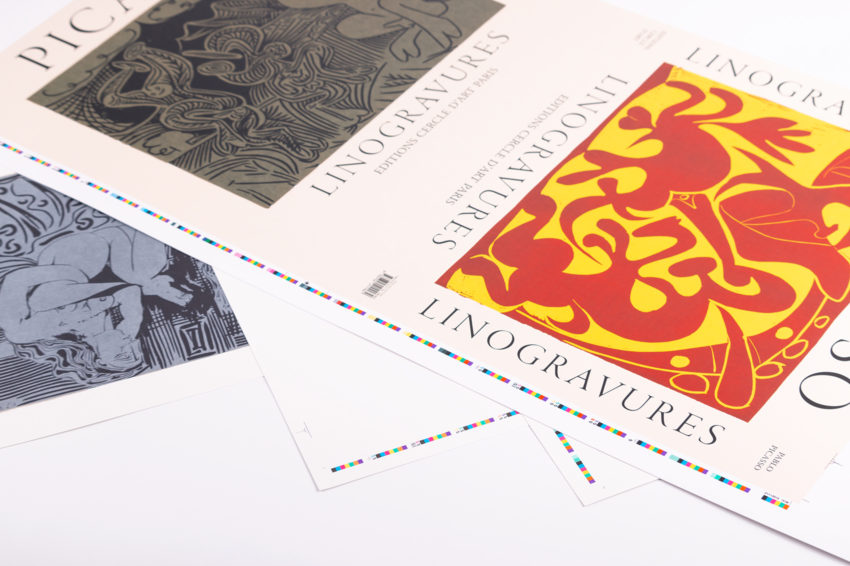
- We created a specific ICC profile for the new UV LED machine, the inks used and the paper chosen, the 350g Old Mill Bianco by Fedrigoni. At the same time we created the output profiles for multicolour incorporating all the profiles described above for the EPSON printer, and the ISO 12647 uncoated or Fogra 47 L proof paper from Les Caméléons as well as the plug in GMG Opencolor for colour retouching.
- In the workshop of Les Caméléons, the photographic retouching and the presentation of completely certified proofs were carried out before printing.
- Once the customer’s approval had been obtained, it was possible to print out a guarantee that the test result signed by the customer and the result on the machine were identical.
The result is an almost impeccable reproduction of openings made in linography with the most innovative technology in printing that we can obtain in the market today: printing by means of multichrome-RGB in a last generation UV LED machine.
Technical specifications
PAGES
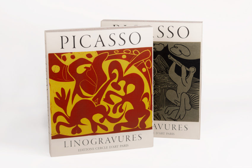
104 + guards + lining + case
PRINT RUN
1,000 copies (500 in French + 500 in English)
BOOK
FORMAT
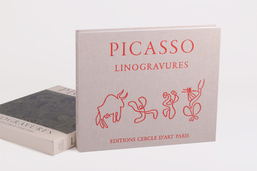
38,5×32 cm (landscape)
COVER
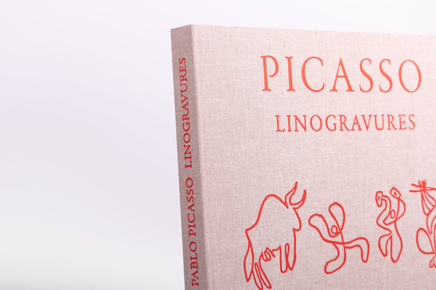
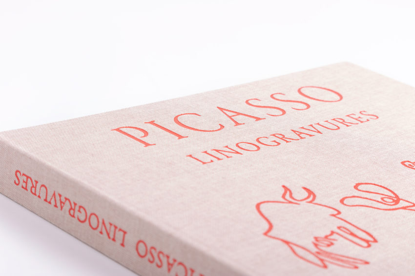
Cialinen 2085 fabric, screen-printed with 2 inks + stamping spine and 1st cover 70%
GUARDS
240 g. white popset printed at 4 + 0 inks
INTERIOR
104 pages: 88 in multicolour + 16 to 1 + 1 (2 languages) Old Mill Bianco paper 350 g.
BINDING
Hard cover 3,5 mm flat back, cups
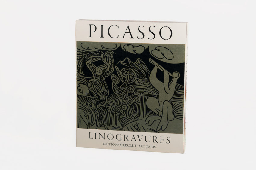
PRESENTATION BOX
FORMAT
37.7×3.5×28 cm (landscape)
PAPER
Graphic card 1 side 580 g.
PRINTING
4 + 1 (offset pigmented part outwards)
DIE-CUT
Die-cut and put book inside

